Showing that the path to success doesn't need to be expensive.
Challenge
Create a brand identity that was solid and straight to the point, that showed their objective is to deliver good campaign results while spending smartly, giving more for less. They had already had some clients and wanted to look more professional to pass more security to new ones.
Solution
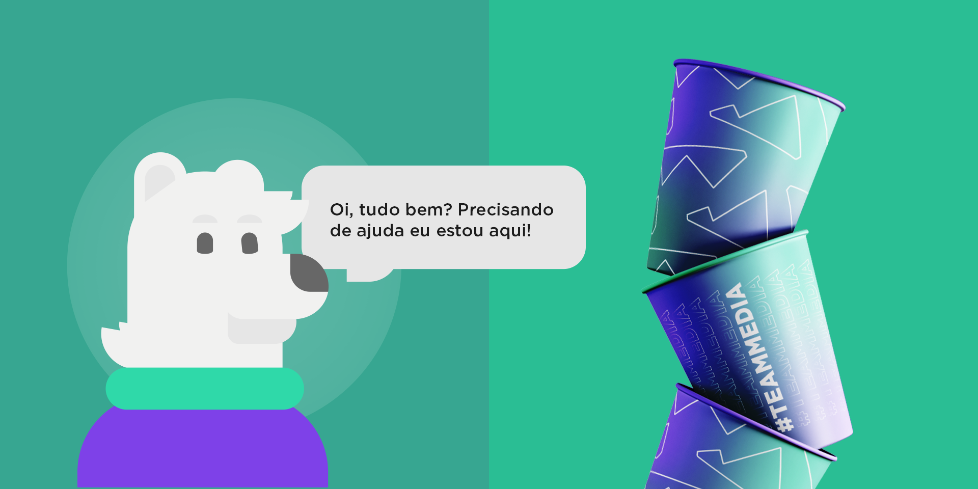
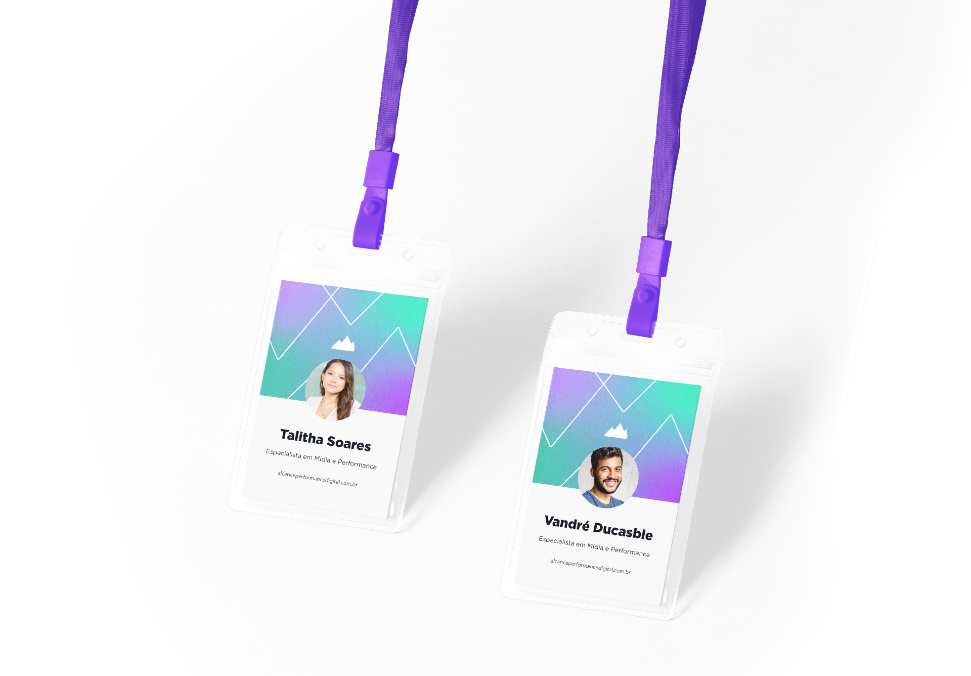
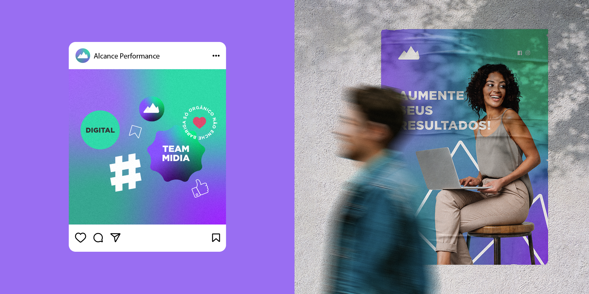
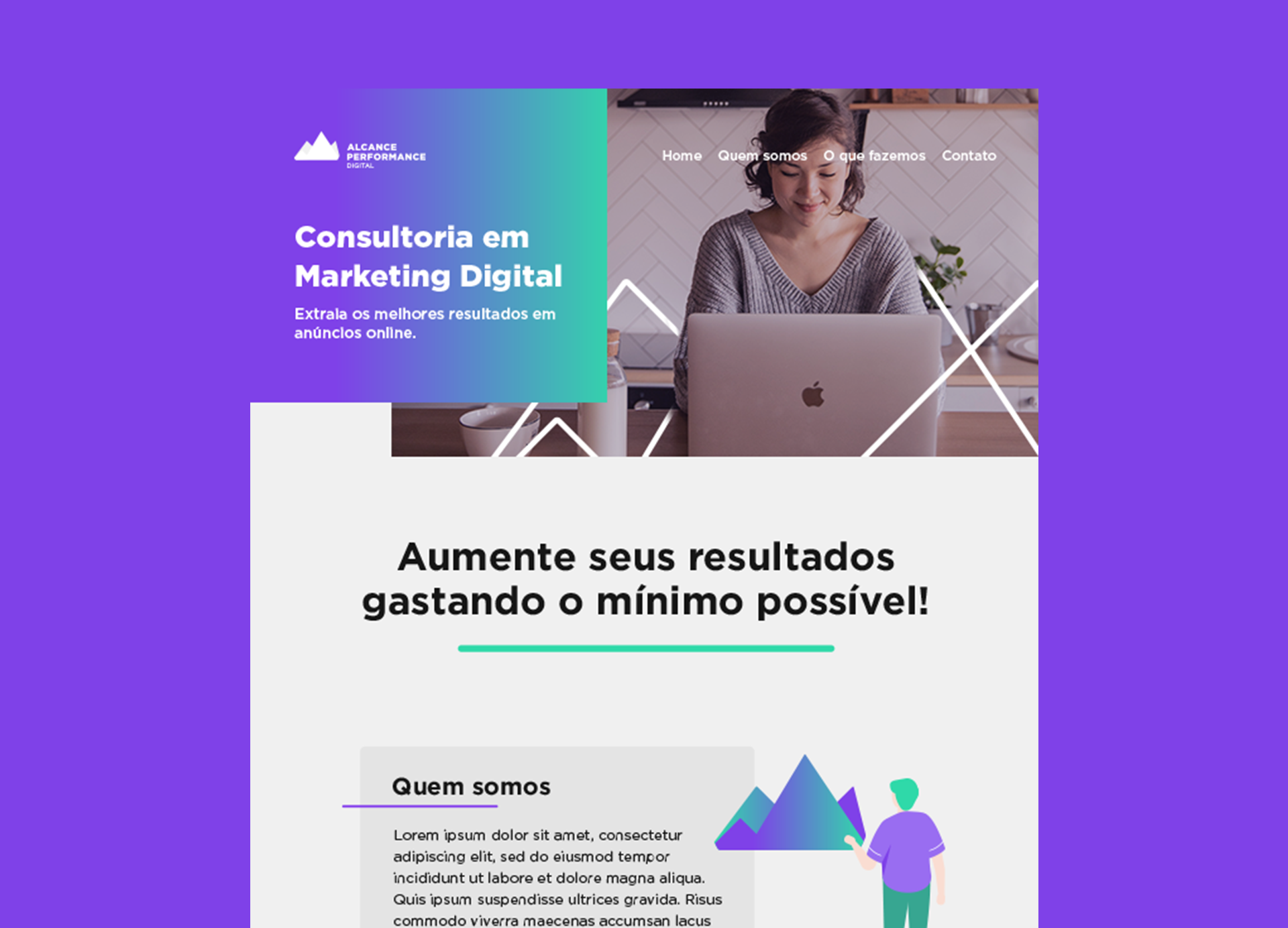
We decided to keep it simple, using a triangle as a base to represent growth, success, and sturdiness. The mountain represents the climb of their client's business from their base to the top, crowning themselves as references in their field.
Sturdy Professional Success Growth Climb